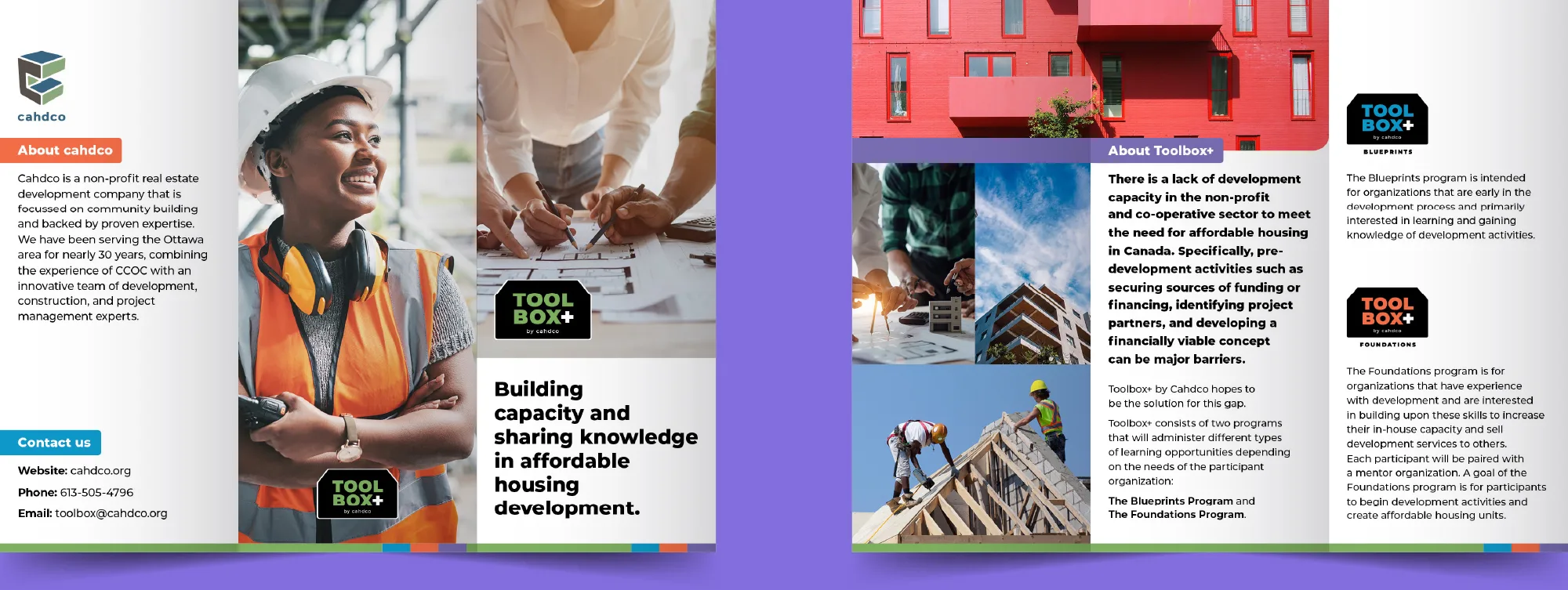
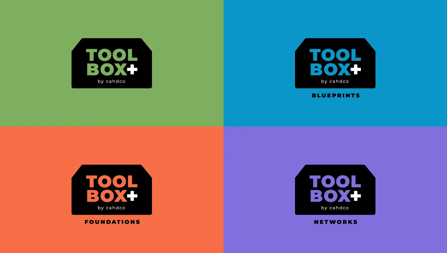
Cahdco began as a non-profit real estate development company and is now recognized as a change agent focused on increasing Canada’s affordable housing supply through development, knowledge sharing and network building. In 2023, it launched the Toolbox+ program to share its expertise and help build a national community of practice to increase the amount and capacity of affordable housing development practitioners. Toolbox+ needed to stand out but not eclipse existing work, which is why Cahdco reached out to Spruce.
Through research and strategy work, we began with a brand refresh to shift the story of the organization from service provider to thought leader in affordable housing. The key messaging was reworked to highlight a proven track record and a community-driven mission to support affordable housing organizations. We then designed and developed a new website that reflects Cahdco’s leadership, communicates their vision and positions the organization as nimble and responsive in a complex, ever-changing industry.