Electricity Canada

Brand strategy & visual identity
A large Ferris wheel glowing with purple lights stands beside a reflective pond at dusk, with city buildings and trees silhouetted against a vibrant pink and blue sky.
Project Type:
  • Brand identity
  • Graphic design
  • Strategy
Sector:
  • City Building
  • Sustainability

In 2021, the Canadian Electricity Association was seeking to rebrand the 125-year-old association to better communicate its role in the energy sector. Spruce was brought on, first to engage its members and stakeholders in the association’s potential, and then to develop a new brand strategy and revised visual identity that would position it for the critical next phase of the organization in supporting Canada’s energy transition.

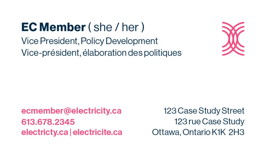
A successful champion of electricity for decades, we heard that the organization was taking on a bolder leadership role in advocating for an electrified, clean energy future. To emphasise the organization’s impact on all Canadians we rearticulated its value proposition and put forward a new name and tagline—Electricity Canada: Our energy future. A new logo and look and feel were then developed to highlight connectivity and optimism.

Simple pink outline illustration of three nuclear cooling towers, with a large central tower flanked by two smaller towers on either side, all set against a light background.
A pink icon of a solar panel on a stand, with a sun and rays shining above it, representing solar energy.
A simple, dark blue line drawing of an electrical plug inside a partial circular outline on a light background.
Simple pink icon of a dam with four water spillways releasing water into a wavy body of water below.
A simple line drawing of a hand with the index finger extended, touching a point with concentric circles radiating outward, symbolizing a touch or tap action on a touchscreen.
A simple icon with a lightning bolt inside a circle above two leaves, representing eco-friendly or sustainable energy.
A simple, dark blue outline of a leaf with a central vein and three smaller veins branching off, set against a light background.
A stylized pink wind turbine with three blades, shown in motion with curved lines indicating movement, on a light background.
A simple pink line drawing of a high-voltage electrical transmission tower with three sets of power lines extending on each side.
Electricity Canada Business Card Back
Electricity Canada Business Card Front

Spruce remains Electricity Canada’s trusted branding and communications partner as we work towards securing a sustainable, Net Zero future.

Related Work